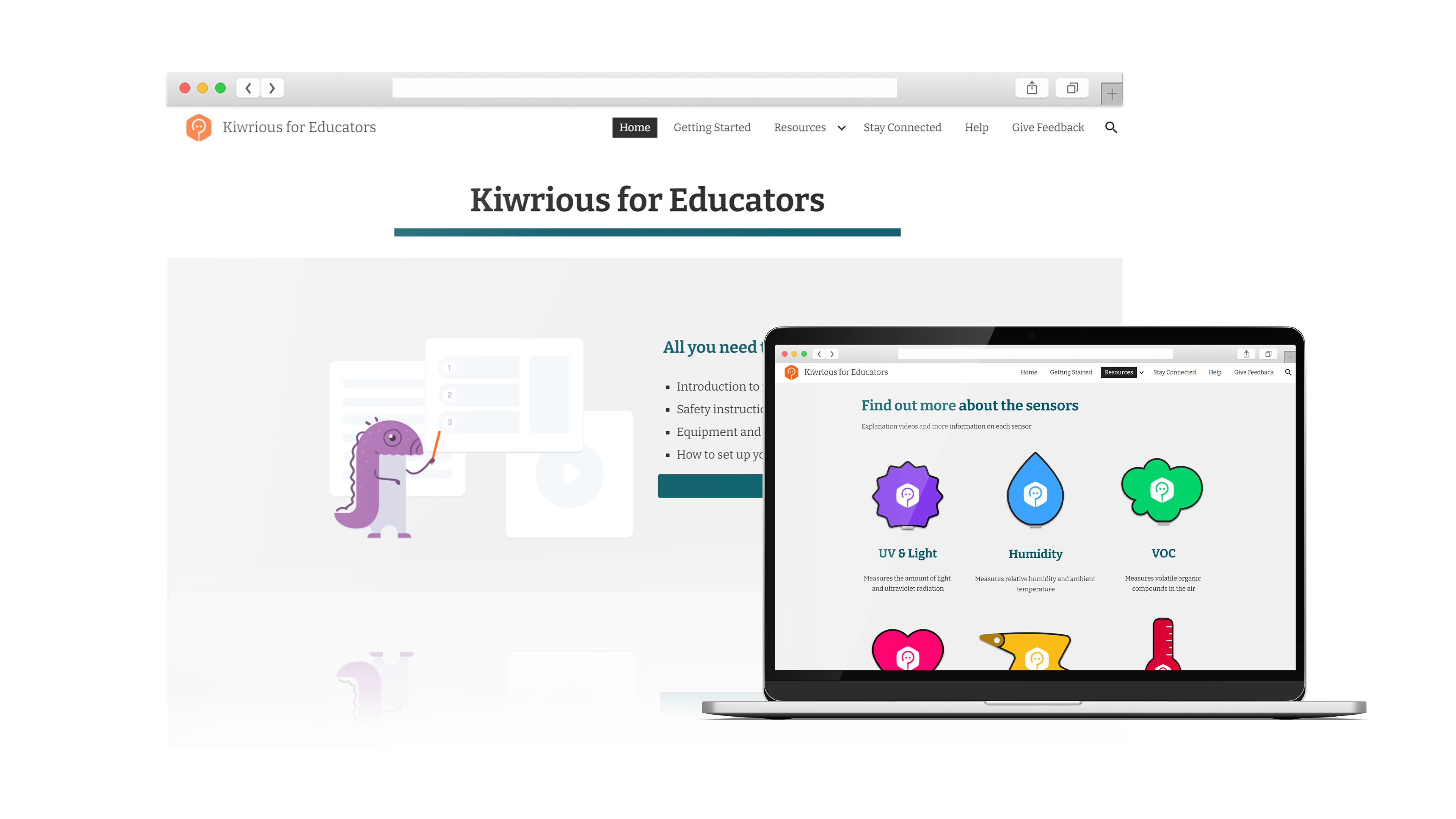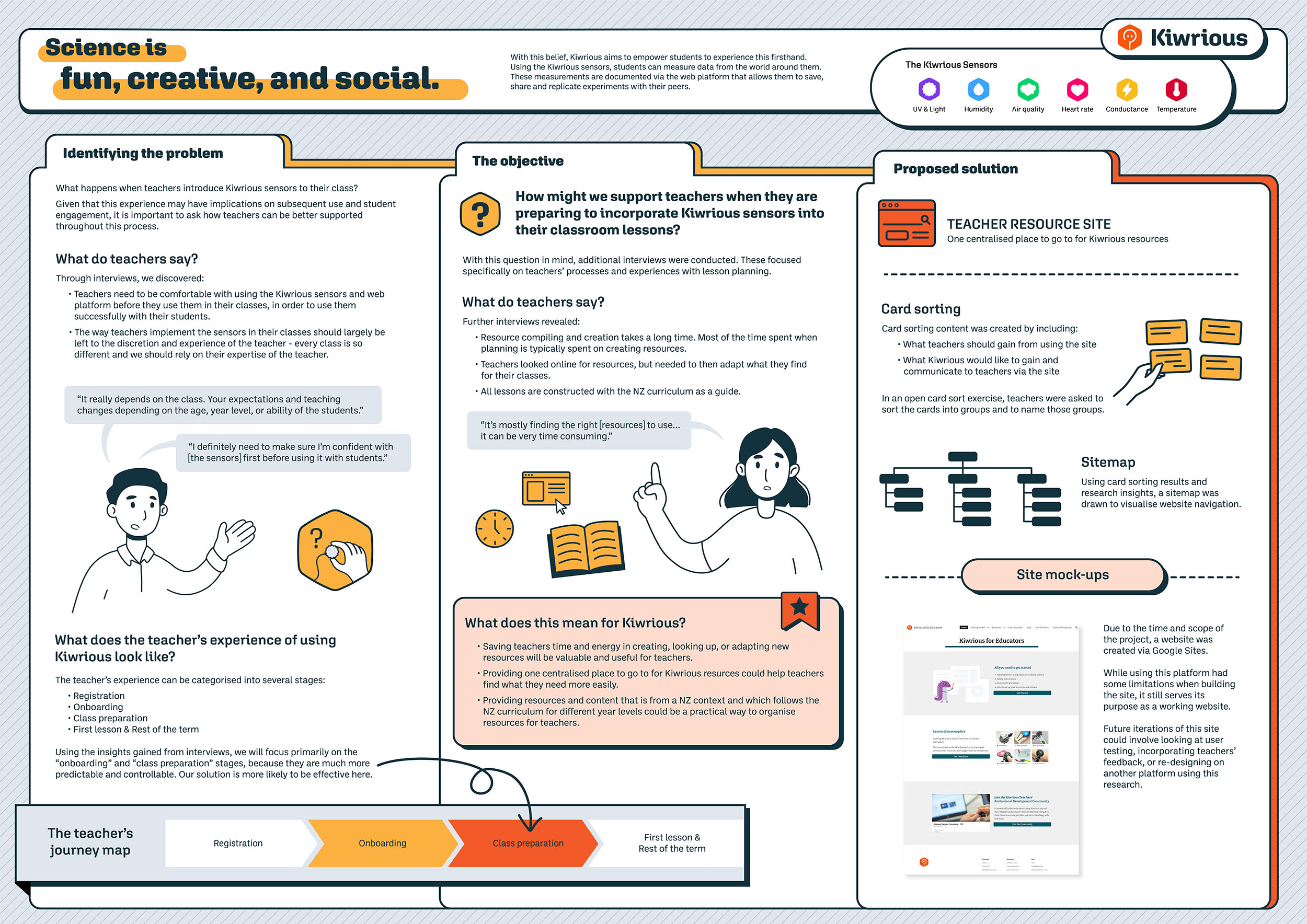

Kiwrious aims to empower students to engage in science. Using their sensors and web platform, students can measure and record data from the world around them. For my uni capstone project, I worked with Kiwrious to look at how we might support the teachers' experience with using these sensors in classrooms.

I interviewed four high school science teachers to ask about their experiences teaching inside the classroom, with a focus on how they might introduce new tools and materials to their students, such as during practical experiments.

Affinity map of teachers' responses, organized into common themes
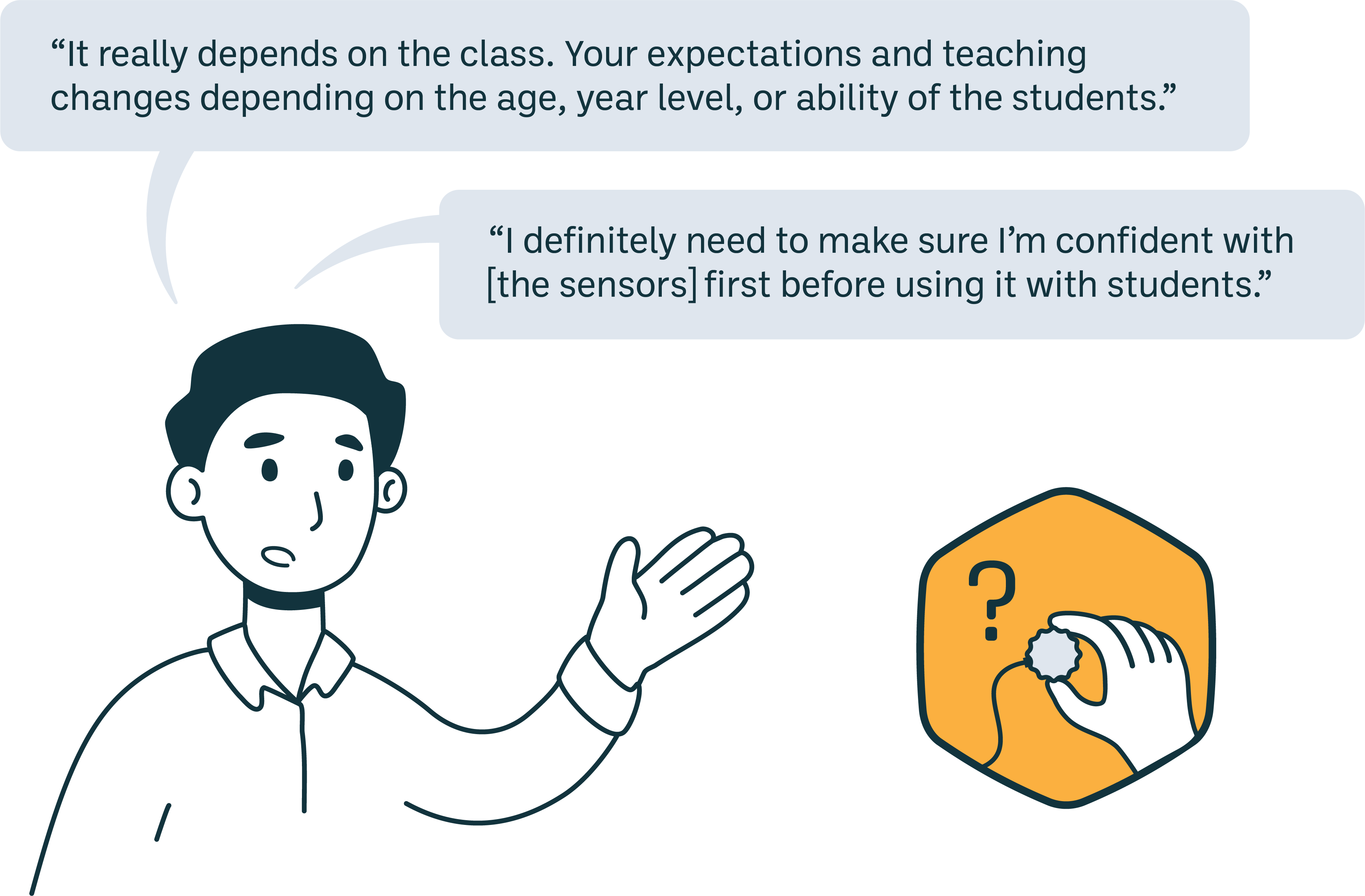
Teachers will need to be comfortable using the Kiwrious sensors and web platform before they use them in their classes, in order to successfully use them with their students.
See findings 1, 3 above.
The way teachers implement the sensors in their classes should largely be left at the discretion and experience of the teacher - every class is so different and we should rely on the expertise of the teacher.
See findings 1, 2, 3 above.
The teacher's journey with Kiwrious can be categorised into four main stages, shown below. The insights from interviews suggest that the Class Preparation stage is the most important and easiest to target (insight 1) and more controllable and predictable than teaching in-class (insight 2).

Journey mapping the teacher's experience
If the class preparation stage is the most effective stage to target, I needed to know more about what happens during this stage. I completed another set of interviews with 3 additional teachers, with a focus more on how they prepare for classes.
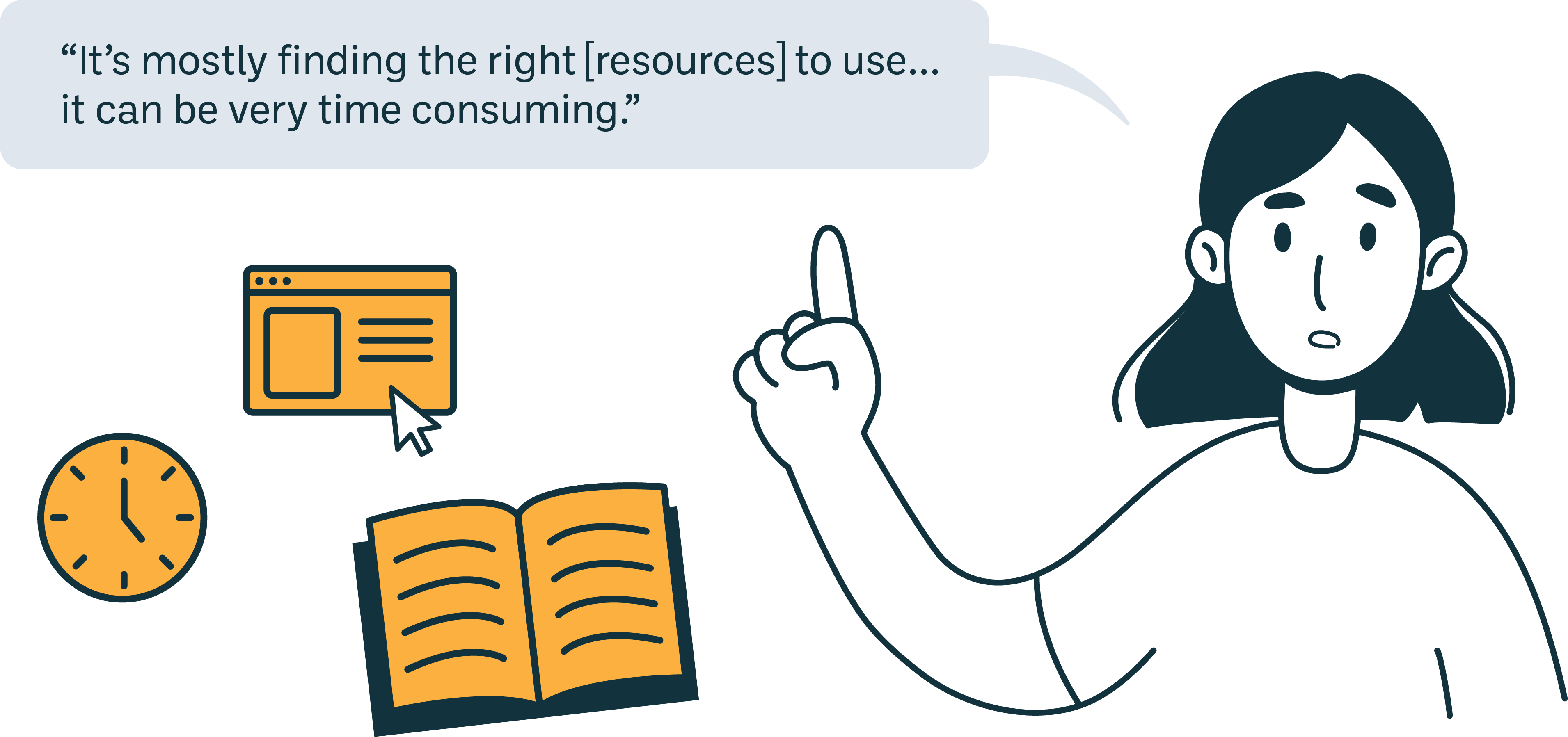
Saving teachers time and energy in creating, looking up or adapting new resources will be valuable and useful to teachers.
See findings 1, 3
Providing one centralised place to go to for Kiwrious resources could help teachers find what they need more easily.
See findings 1, 2
Providing resources and content that is from a NZ context and which follows the NZ curriculum for different year levels could be a practical way to organise resources for teachers.
See findings 2, 3
Kiwrious already had lesson plans / templates and prepared workshops and other content to supplement use of the sensors. To bring all these together, I proposed to create a teacher resource site (see insight 2).
Project scope: to build a working platform within a limited time frame of 3-4 weeks, I chose to use Google Sites to host the website. It would it allow easy integration of Google Docs / Drive, where some of these teacher resources were stored.
Kiwrious had content to fill the site, but I had little understanding of how to structure it. So, I performed a card sorting exercise with five teachers and used that data to build a site map before building the site.
To create content for card sorting, I evaluated business (Kiwrious) needs against user (teacher) needs. Taking these, I then aligned them with current content that was available through Kiwrious.
Using OptimalWorkshop to conduct an open card sort, teachers were asked to sort these cards into categories that made sense to them, and then to name those categories.
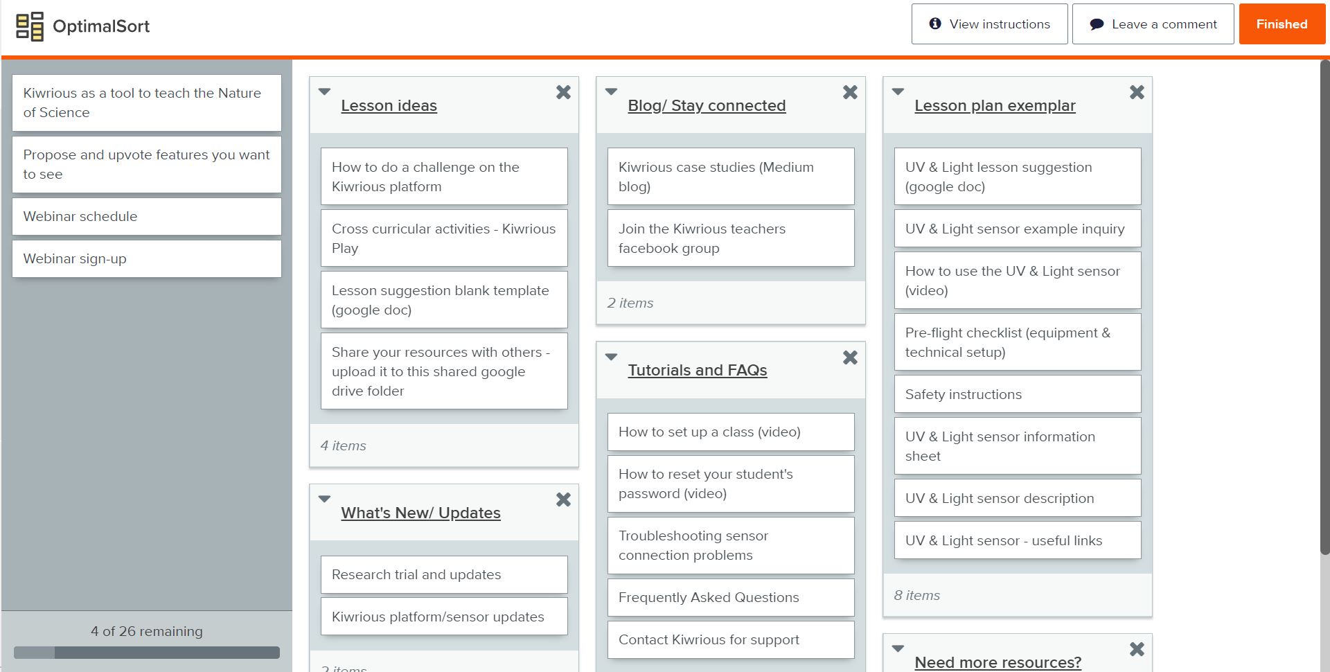
Screenshot of one participant's card sort using OptimalWorkshop
Using the results from the card sorting, background research from other similar educational websites, and findings and insights generated from both rounds of interviews, a site map was created.
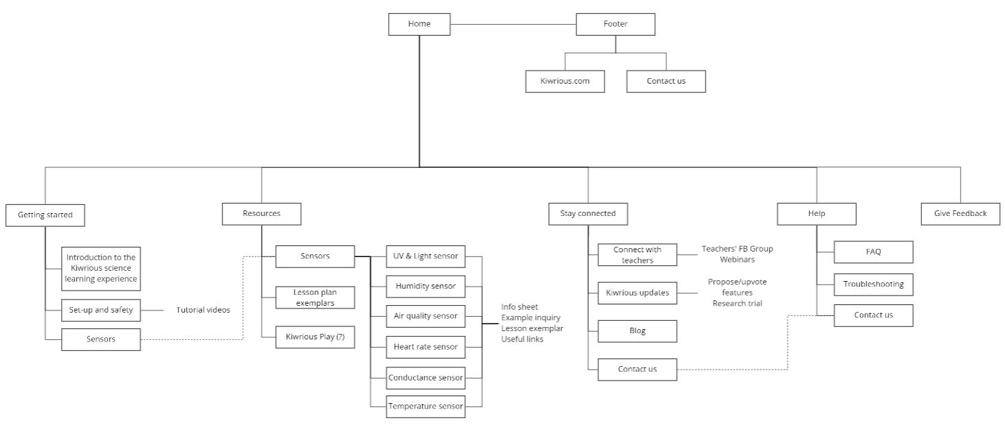
After discovering design limitations from using Google Sites and seeing the site visually, the final site condensed several pages from the original site map. Though this meant that the final site looks slightly different to the above site map, the overall organization of content remained largely the same. Most importantly, the site is fully functional and usable by teachers.
The completed website can be found at Kiwrious for Educators.
